Packaging Design, Illustration and Typography
March 2026
Illustrator and Photoshop
Overview
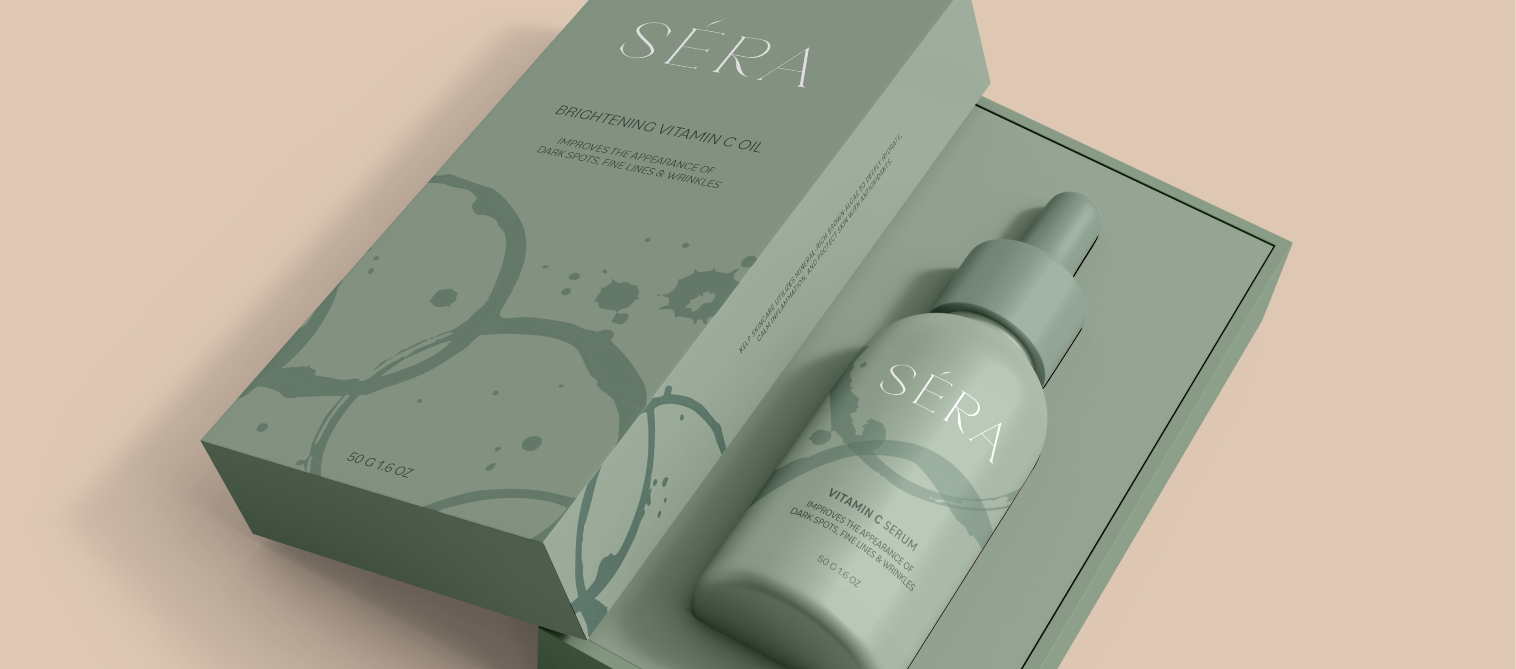
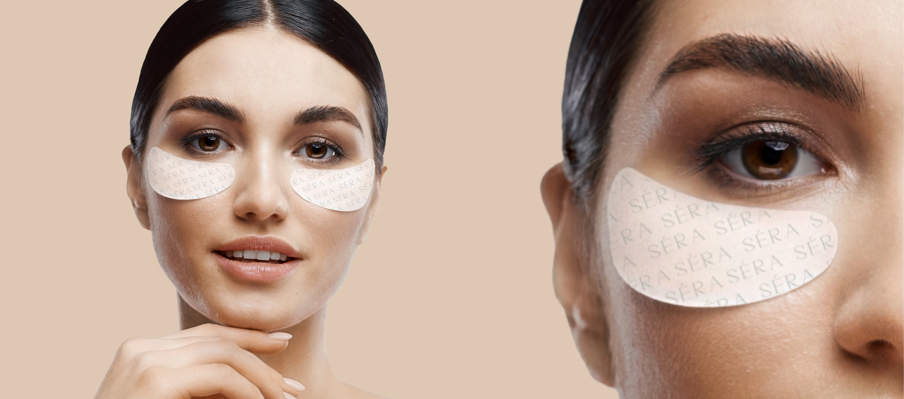
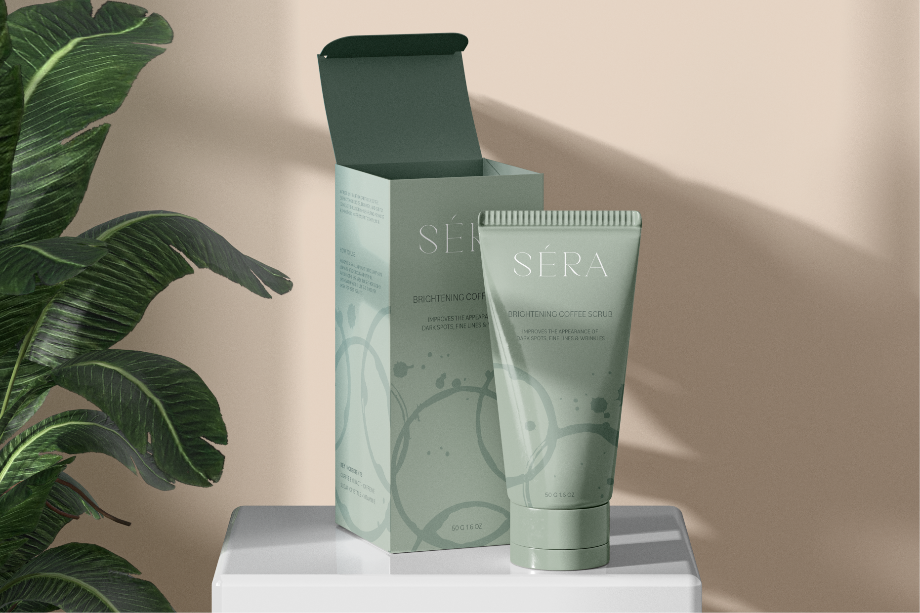
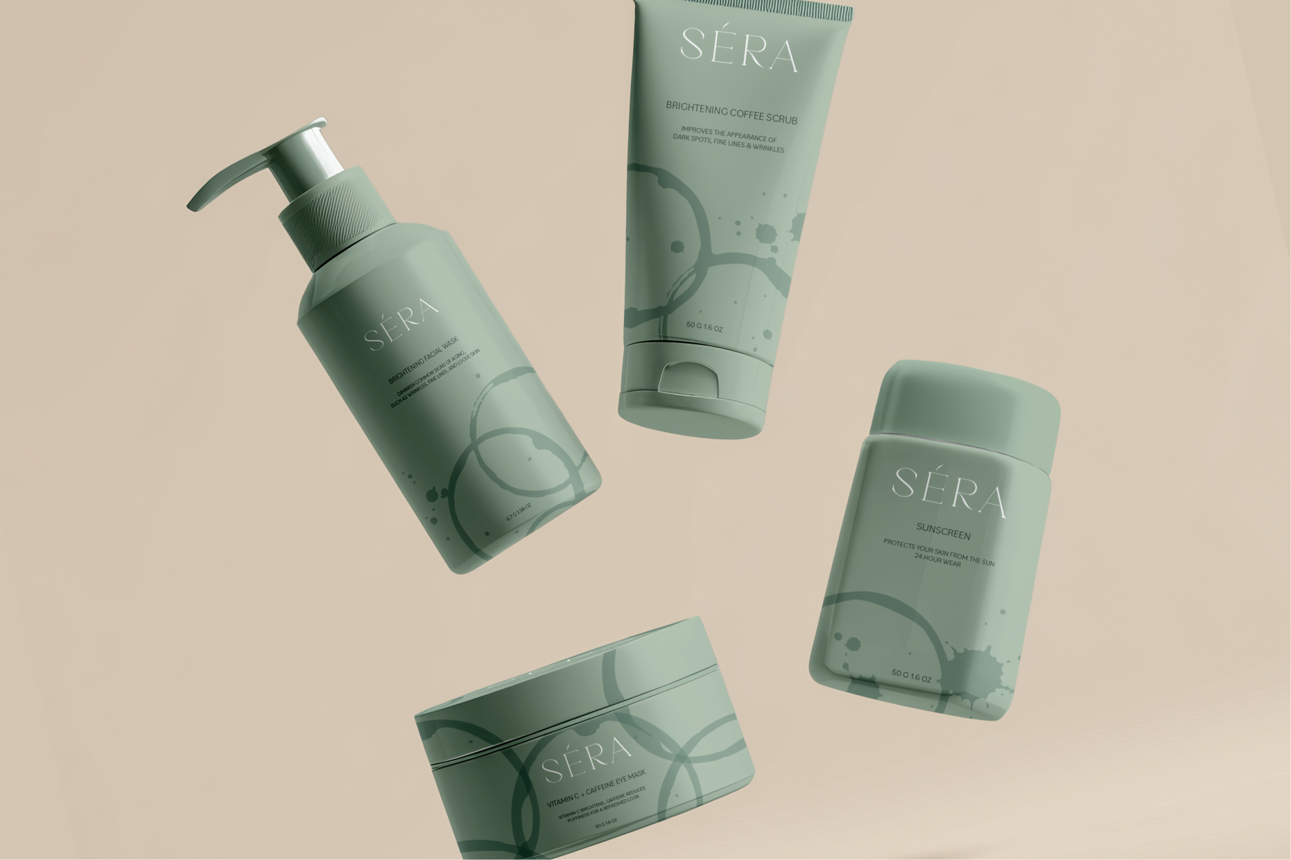
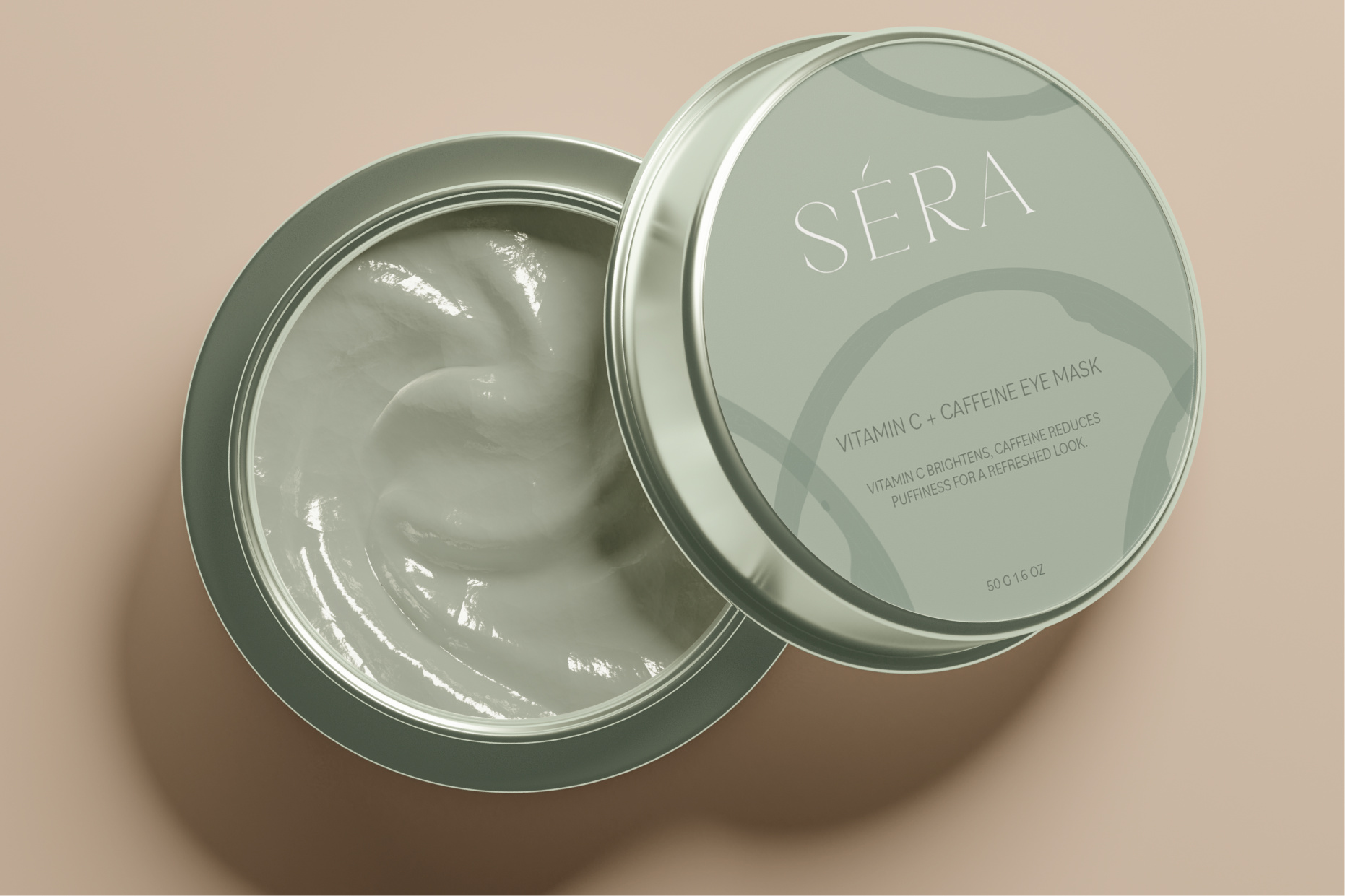
Sera is a skincare brand inspired by coffee and its natural brightness. The goal was to create something that feels clean and easy to understand from the first look.
I focused on a monochrome green palette to keep the system simple and consistent. It gives the brand a fresh, grounded feeling while still standing out. The typography is minimal and clear, helping the product feel approachable.
I thought a lot about balance. Letting color, type, and spacing do the work without adding too much. The result feels quiet, but considered.

Discover More Inspiring Spaces
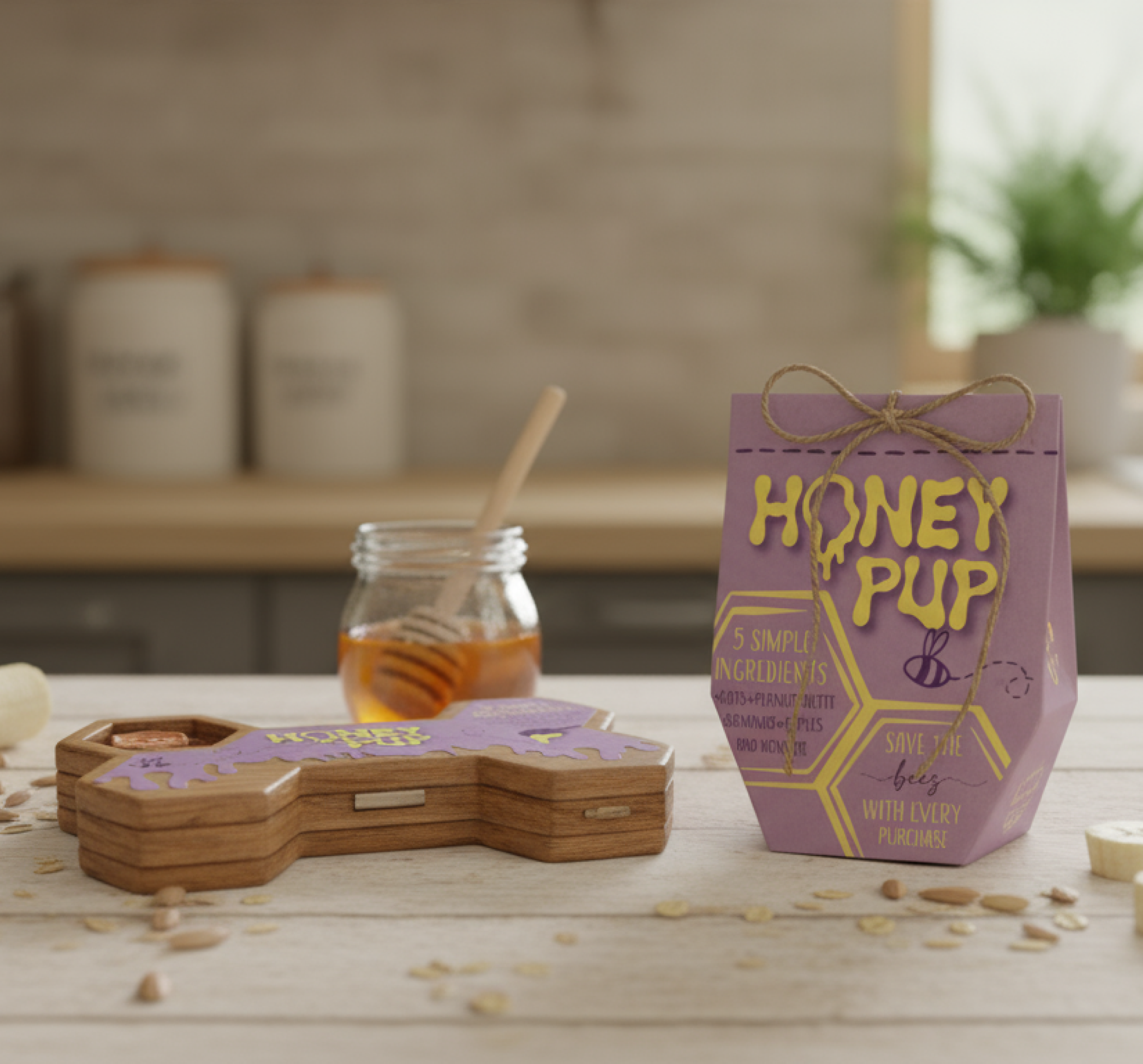
Honey Pup
Illustrator, Photoshop, Indesign and Fusion 360
October 2024